
About Me
Hi! I'm Ashraf and I'm a data enthusiast diving into the world of data analytics.I focus on creating reports and visualizations for data-driven businesses.I’m laser-focused on creating business insights that drive decision making, and I help companies ⚡automate⚡ reports that connect to all their data.
Skills

Excel | Power BI | Microsoft Fabric | SQL | Python
Data Visualization
Business Analytics
Report Development
Presentation Skills
Featured Projects
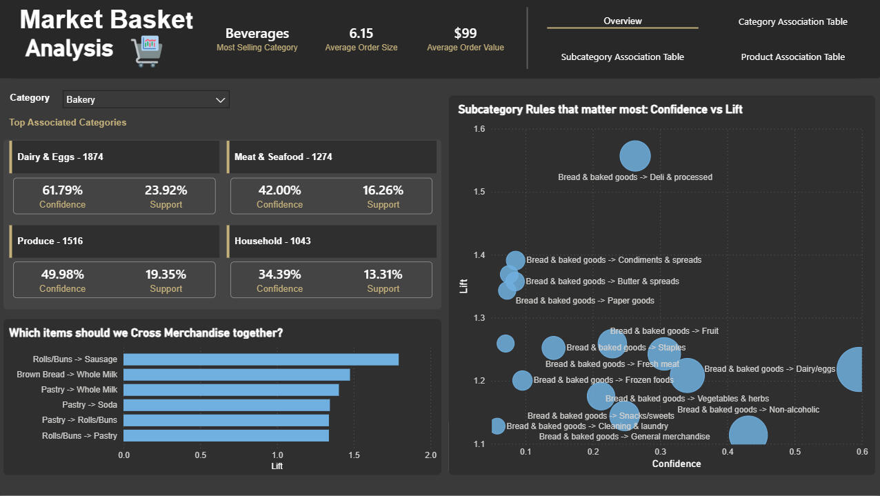
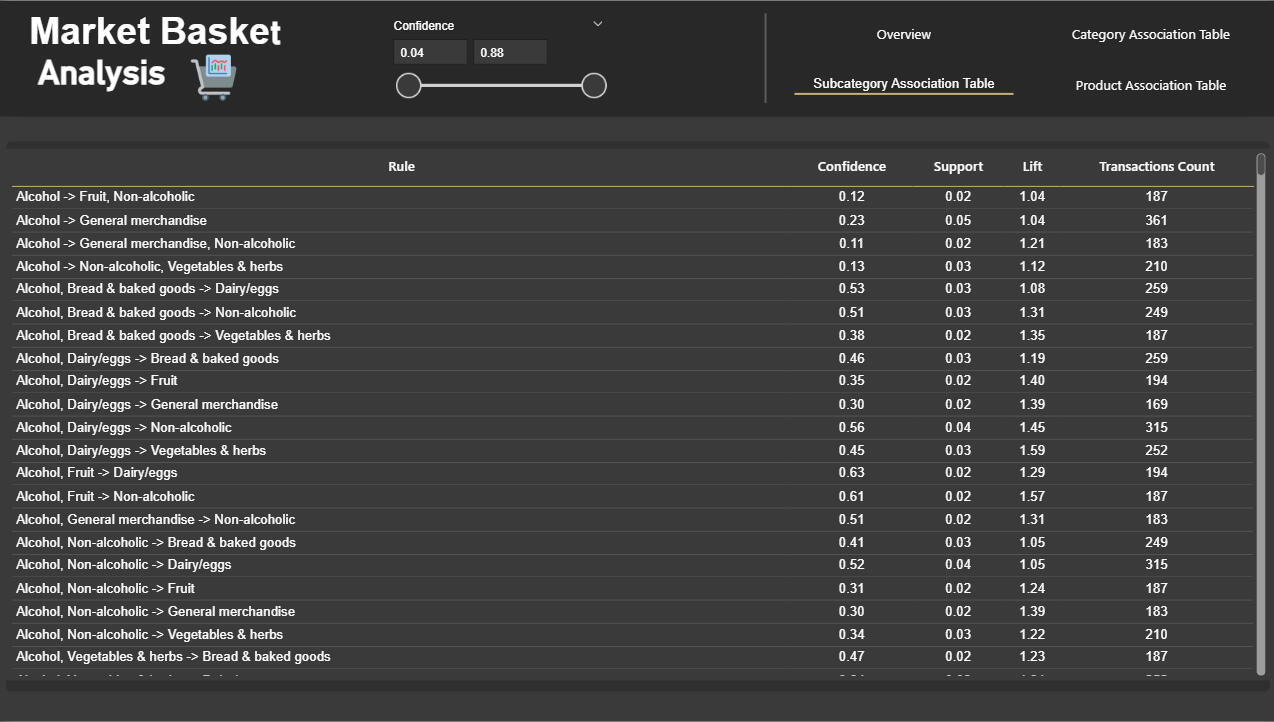
Basket Analysis & Cross‑Merchandising — (Python & Power BI)

End‑to‑end market‑basket analysis (Python + Power BI) that uncovered product and category affinities to inform cross‑merchandising and bundled promotions, plus a measurement plan to validate commercial uplift.
Inventory Management Dashboard — Retail / E-commerce (Power BI)

Interactive Power BI dashboard that consolidates inventory and sales data to visualize stock levels, inventory value, turnover, sell-through and days of inventory on hand. Includes UX features (filter pane with bookmarks, reset button), image-based stock status, and DAX measures to drive procurement and merchandising decisions
Customer Analytics & RFM Segmentation Dashboard (Power BI)

This project delivers a customer analytics dashboard designed to help marketing teams understand customer behavior, segment audiences effectively, and execute data-driven campaigns. The report combines demographic insights, transactional behavior, and RFM segmentation into a clean, interactive Power BI solution.
Regional Sales Analysis – End-to-End Analytics (Python, Power BI)

Built an end-to-end regional sales analytics workflow from raw multi-sheet Excel to a cleaned data
model, python-based EDA and a multi-page Power BI dashboard highlighting products, channels and
regions driving revenue and profit.
EXCEL Automated and Interactive Sales Analysis System

This project addresses the challenges of scattered, unstructured sales data from multiple store locations and transforms it into a self-service analytics system. Streamlining data entry, cleaning, statistical analysis, and interactive dashboard reporting
Professional Certifications
My growing list of proprietary, exam-based certifications.

Microsoft Certified Power BI Data Analyst (PL-300) | Issued 2025

CFI Financial Planning & Analysis Professional (FPAP) | Issued 2025

Microsoft Certified Faric Analytics Engineer (DP-600) | Issued 2025

Datacamp Data Analyst | Issued 2025

Microsoft Certified Azure Data Fundamentals (DP-900) | Issued 2025
Basket Analysis & Cross‑Merchandising — (Python & Power BI)
Problem & goalRetail teams need clear, data-backed product/category pairings to guide cross‑merchandising and bundle experiments that can lift AOV and items per basket.
Goal: Identify reliable affinities (Category/Subcategory/Product) and convert them into measurable commercial actions.---What I built- End‑to‑end market‑basket mining pipeline: cleaning → basket encoding → FP‑Growth → association rules → exports.
- Power BI report to prioritize rules visually (strength vs relevance) and support stakeholder decision-making.---DataTransactional FMCG dataset at basket level (OrderID, Product, Subcategory, Category).
Preprocessing focused on standardized labels, deduplication of OrderID–item pairs, and memory‑efficient sparse boolean encoding.---Method (step-by-step)1. Cleaned and standardized product/category labels; removed duplicates so each OrderID–item indicates presence (not quantity).
2. Built sparse one‑hot basket matrices to handle high SKU counts efficiently.
3. Mined frequent itemsets via FP‑Growth at Category, Subcategory, and Product levels using level‑appropriate minimum supports.
4. Generated and filtered rules using lift first, then confidence/support; extracted 1→1 rules for easy business translation.
5. Exported ranked CSVs and surfaced top rules inside Power BI for interactive prioritization.---Dashboard visuals- KPI header: top category + average items per order + average order value for immediate context.
- Top associated category tiles: confidence & support per pair for quick decisions.
- Bubble chart: Confidence vs Lift (size = support) to balance “strong” vs “common”.
- Cumulative lift bar chart to communicate upside fast.
- Exportable rules table (sortable rule, confidence, support, lift, transaction counts).---Deliverables- Interactive Power BI report (PBIX + live demo embed).
- Reproducible notebook / script pipeline that generates CSV outputs for Category/Subcategory/Product rules.
- Ranked CSV exports for operational handoff and an A/B test measurement plan.
- One‑page executive summary for stakeholders (visual + 3 bullets).---How to operationalize these results quickly1. Filter exported rules for minimum transaction counts and business thresholds (lift/confidence) to create a shortlist.
2. Convert shortlisted rules to concrete experiments (bundles, placement, price promos) and assign to a category owner.
3. Run controlled experiments with a clear measurement window (4 weeks) and track AOV, items per basket and incremental revenue.
4. If successful, roll out high‑performing bundles at scale and feed results back to recommendation lists.---Project repository on GitHub
Inventory Management Dashboard — Retail / E-commerce (Power BI)
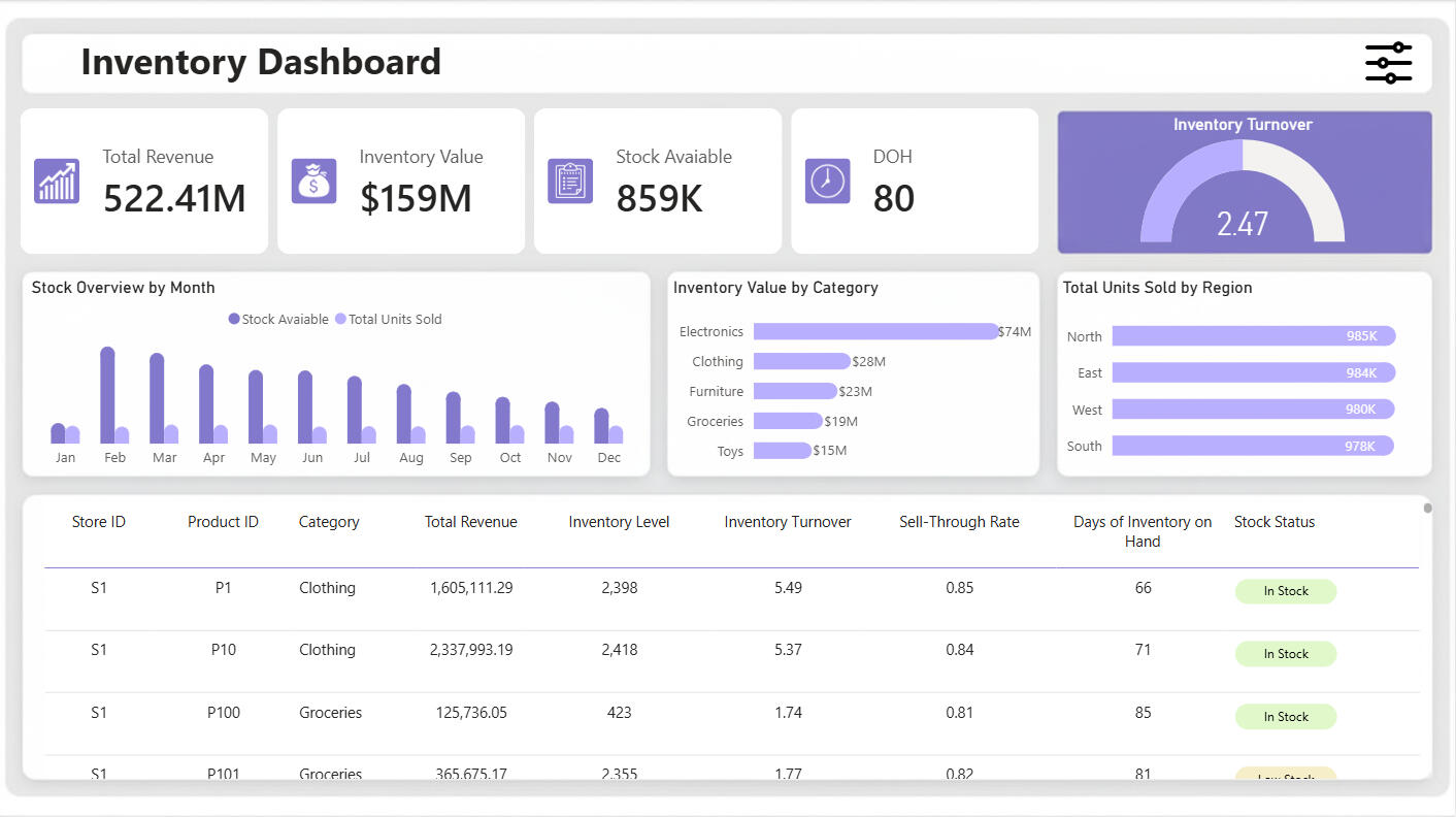
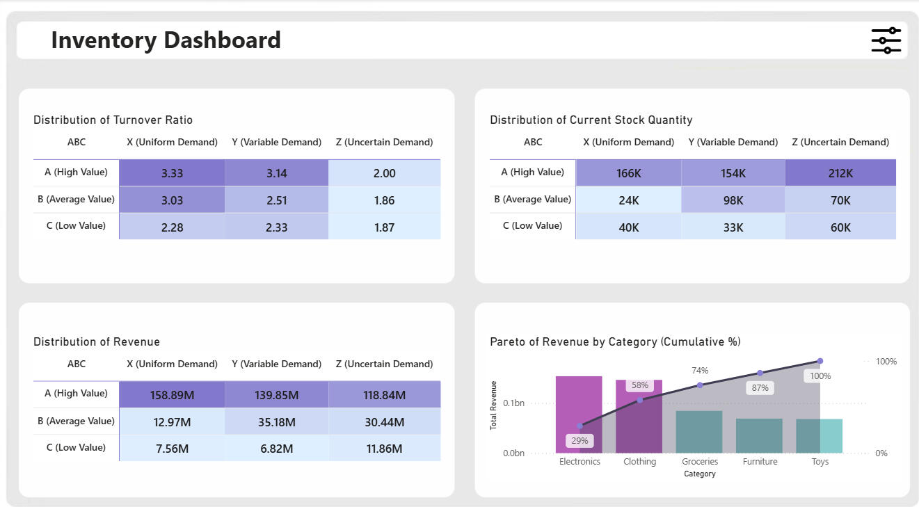
Problem statementRetail teams struggle to know which SKUs are fast vs slow moving, how long current stock will last, and which categories/regions need replenishment — especially around seasonal/festival demand spikes. This dashboard centralizes the answers and provides operational actions (reorder, promotion, transfer).DataInput: CSV with fields including date, storeID, productID, category, region, inventoryLevel, unitsSold, unitsOrdered, price, discount, plus contextual columns (seasonality, weather, holiday). (Data covered from 2022–2024.)Tools & techPower BI Desktop, DAX, Power Query (M), PowerPoint (wireframes & background art), basic SVG for image statuses, CSV dataset.Key metrics & formulas (high-level)Below are the principal measures implemented (copyable DAX provided in README section):- Total Units Sold — SUM of UnitsSold- Stock Available — SUM of InventoryLevel- Inventory Value — on-hand value considering discounts (InventoryLevel × Price or Price*(1−Discount) when discount exists).- Total Revenue — UnitsSold × Price (accounting for discounts).- Average Inventory (monthly) — monthly average of inventory used to compute turnover.- Inventory Turnover — TotalUnitsSold / AverageInventory.- Sell-through Rate — TotalUnitsSold / (TotalUnitsSold + StockAvailable).- Days of Inventory on Hand — AverageInventory / AverageDailySales (used for procurement lead-time planning).Visuals & interaction- KPI cards: Revenue, Inventory value, Stock available, Days OIH.- Gauge: Inventory turnover ratio.- Monthly stock overview: Clustered column comparing units sold vs stock available (chronological sorting via MonthNumber).- Inventory value by category / units sold by region: horizontal bars with data labels & rounded edges.- Detailed table: storeID, productID, category, units sold, revenue, inventory level, turnover, sell-through, days OIH, and an image/SVG status (in-stock / low-stock / out-of-stock).- UX: Filter “pin” with Year / Month / Region / Store / Category / Product slicers, bookmark-driven open/close and reset buttons (preserves selection state).What I learned- Designing pixel-perfect Power BI backgrounds and using bookmarks for polished UX.- How to translate inventory theory (ABC, safety stock, festival demand) into practical DAX measures and visual triggers.
EXCEL | Automated and Interactive Sales Analysis System


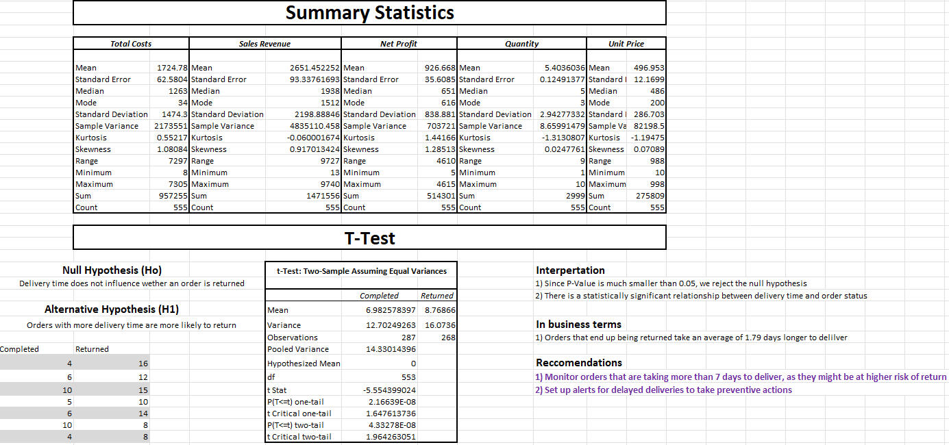
A complete end-to-end sales analysis and reporting solution built entirely in Microsoft Excel. This project addresses the challenges of scattered, unstructured sales data from multiple store locations and transforms it into a self-service analytics system—streamlining data entry, cleaning, statistical analysis, and interactive dashboard reporting.🔍 Project Overview
Manual reporting was time-consuming and error-prone, with sales data coming from various stores in inconsistent formats. This Excel-based solution automates the entire process:Data Entry: A user-friendly form restricts input to validated fields, reducing errors and ensuring consistency.
Automation: Behind-the-scenes data cleaning and processing happens instantly on form submission.
Analytics: Includes built-in statistical analysis (descriptive stats, trend analysis, t-tests) for deeper insight.
Visualization: An interactive dashboard enables users to explore sales trends, performance, and key metrics with just a few clicks.🧠 Features- ✅ Locked & Validated Sales Entry Form
- ⚙️ Automated Data Cleaning & Processing (VBA & Formulas)
- 📈 Built-in Descriptive & Inferential Statistics
- 📊 Dynamic Dashboard with PivotTables, PivotCharts & Slicers
- 🚀 80% Reduction in Manual Reporting Time📊 Dashboard InsightsThe dashboard enables users to:- Track revenue trends over time
- Compare store and regional performance
- Analyze sales growth and product category impact
- Explore actionable insights for pricing and inventory strategy🛠️ Tools & Technologies- Microsoft Excel
- Advanced Formulas
- VBA Macros
- PivotTables & PivotCharts
- Data Validation
- Applied Statistics
- Data Cleaning & Automation
- Dashboard Design📈 Impact- 🕒 Reduced reporting time by over 80%
- 📉 Minimized manual errors with validated data entry
- 🎯 Helped business teams make data-driven decisions faster
Customer Analytics & RFM Segmentation Dashboard | Power BI
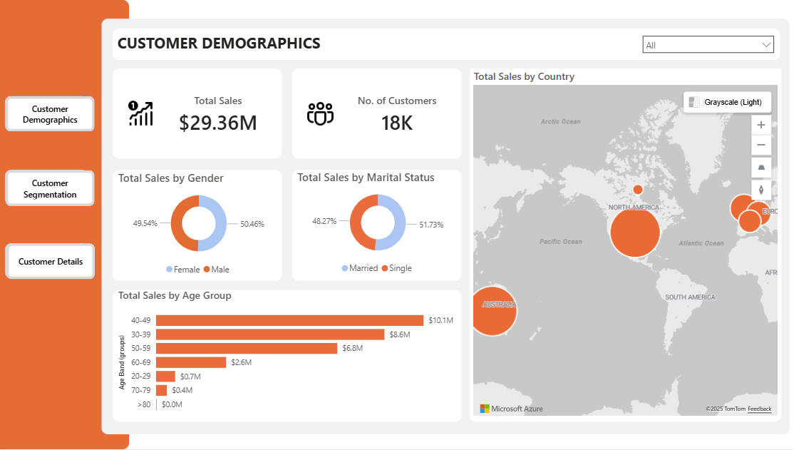
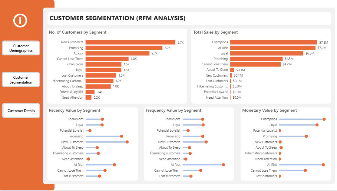
🔍 PROJECT OVERVIEW
This project delivers a customer analytics dashboard designed to help marketing teams understand customer behavior, segment audiences effectively, and execute data-driven campaigns. The report combines demographic insights, transactional behavior, and RFM segmentation into a clean, interactive Power BI solution.🎯 BUSINESS OBJECTIVE
• Understand customer demographics and geographic distribution
• Identify high-value and at-risk customers using behavioral data
• Target marketing campaigns more effectively through segmentation
• Drill into customer-level data for activation and outreach🧱 DATA MODEL & PREPARATION
• Built a star-schema data model using AdventureWorks data (Customers, Products, Geography, Dates, Internet Sales)
• Cleaned and optimized data in Power Query (correct data types, column pruning, data profiling)
• Established correct relationships to ensure model performance and analytical accuracy📄 DASHBOARD PAGES
👥 Customer Demographics
• KPI cards for Total Sales and Number of Customers
• Sales distribution by Gender and Marital Status
• Sales by Age Band using custom age calculations
• Geographic sales analysis by country
• Product-level filtering with drill-through to customer details🧠 Customer Segmentation (RFM Analysis)
• Recency: Time since last customer purchase
• Frequency: Number of distinct purchases per customer
• Monetary: Total customer spend
• Percentile-based RFM scoring (1–5) using DAX
• Classification into 11 actionable customer segments (Champions, Loyal, At Risk, Lost, etc.)
• Lollipop-style visuals for comparing segment behavior
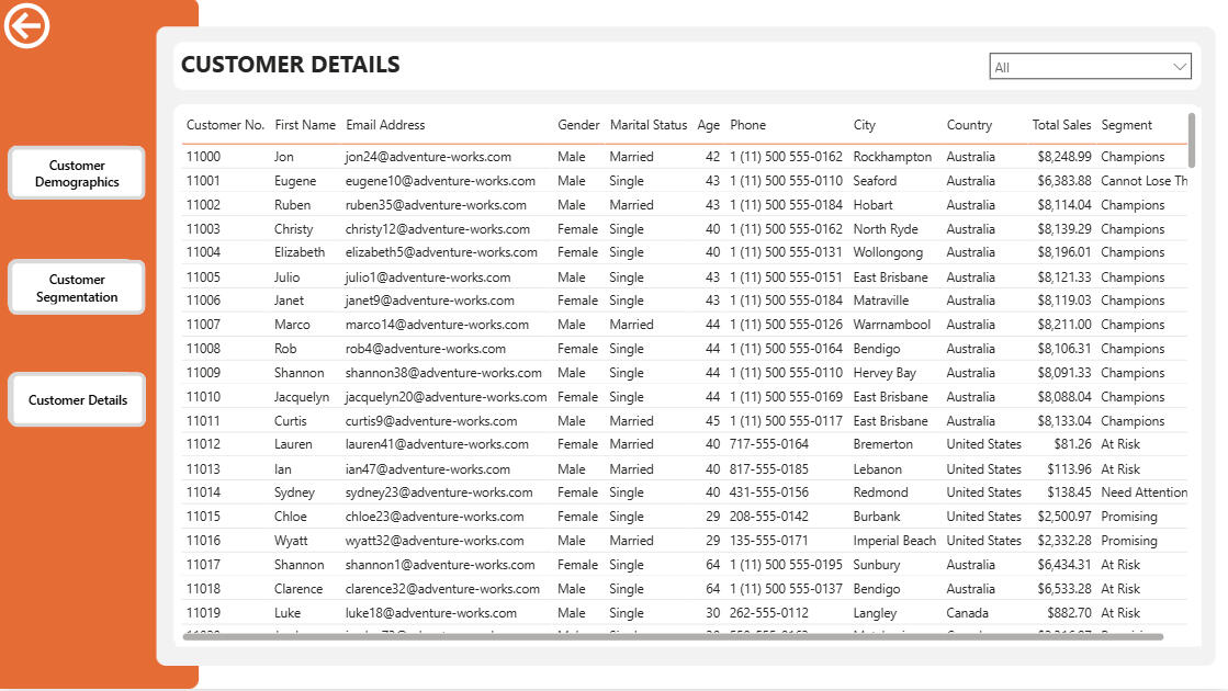
• Drill-through from segment to individual customers👤 Customer Details
• Dedicated drill-through page for customer-level analysis
• Displays personal details, location, segment, and total sales
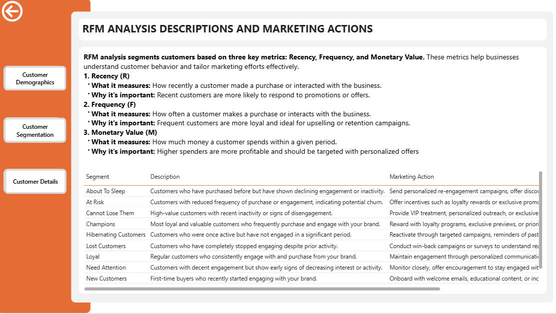
• Option to remove filters and view the full customer base📘 Segment Definitions & Marketing Actions
• Clear explanation of RFM analysis
• Description of each customer segment
• Recommended marketing actions for every segment
• Hidden page accessed via an info icon to maintain clean navigation🚀 OUTCOME & VALUE
• Converts raw sales data into actionable customer intelligence
• Supports targeted marketing, retention, and personalization strategies
• Demonstrates strong skills in data modeling, DAX, analytical thinking, and dashboard UX design
Regional Sales Analysis – End-to-End Analytics (Python, Power BI)
Regional Sales Analytics DashboardProject OverviewThis project demonstrates an end-to-end data analytics workflow for a regional sales analytics engagement at a hypothetical retail/e-commerce business. Starting from raw, multi-sheet Excel data, I designed a relational data model, cleaned and transformed data using Python, performed exploratory analysis, and built an interactive Power BI dashboard to enable data-driven decision-making across the organization.Role: End-to-End Data Analyst / MIS AnalystTechnology Stack:
- Python (pandas, NumPy, matplotlib, seaborn)
- Google Colab
- Excel
- Power BIData: 5+ related tables spanning multiple years of historical sales data with 2017 budget targets---Business Problem & ObjectivesChallenge: Sales leadership lacked a consolidated, data-driven view of regional performance and had difficulty identifying where revenue and profit were truly generated.Project Goals:
1. Identify top-performing products, channels, and regions by revenue and profit metrics
2. Understand monthly trends and detect seasonality patterns in sales data
3. Compare actual 2017 performance against 2017 budget targets at the product level
4. Enable self-service exploration and ad-hoc analysis through an interactive dashboard---Data Architecture & ModelingSource Data Structure
The raw data arrived as a multi-sheet Excel file containing:
- Sales Orders – Transaction-level data (orders, dates, quantities, prices, and relational keys)
- Customers – Customer master data
- Products – Product master data
- Regions & State Regions – Geographical hierarchy
- 2017 Budget – Product-level annual budget targetsData Modeling Approach
I began by sketching an Entity-Relationship (ER) diagram to map primary and foreign keys across all tables. In Python, I then:- Standardized headers and corrected malformed rows
- Merged sales orders with customers, products, regions, state regions, and budget tables using identified keys
- Dropped redundant keys no longer needed after joins
- Standardized all column names to a consistent format for reproducible analysis---Data Cleaning & Feature EngineeringAfter joining the base tables, I implemented the following transformations:Data Refinement:
- Removed low-value or redundant fields to maintain a lean, efficient data model
- Standardized data types and handled missing values systematicallyDerived Metrics:
- Revenue – Line total for each transaction
- Total Cost – Order quantity × unit cost
- Profit – Revenue minus total cost
- Profit Margin (%) – Profit divided by revenue
- Average Order Value (AOV) – Per-order aggregation
- Order Month – Extracted for time-series analysisBudget Handling:
- Carefully nulled budget values for non-2017 orders to prevent misleading year-over-year comparisons and maintain analytical integrity---Exploratory Data Analysis (EDA)I conducted systematic exploratory analysis in Python to answer key business questions:1. Revenue Trends Over Time
- Built monthly revenue time-series to detect spikes and troughs
- Aggregated across years to identify seasonal patterns by calendar month
- Finding: Clear seasonality with peaks in certain months and troughs in others2. Channel Performance
- Calculated revenue distribution across Wholesale, Distributor, and Export channels
- Visualized channel mix composition
- Finding: Wholesale and Distributor dominate revenue; Export represents a smaller opportunity3. Product Performance
- Ranked all products by total revenue generated
- Identified clear leaders with significantly higher revenue than secondary products
- Finding: Concentrated revenue; top products drive disproportionate share4. Order Value Distribution
- Analyzed Average Order Value (AOV) across all transactions
- Finding: Right-skewed distribution with many small orders and a long tail of high-value transactions5. Data Quality & Anomalies
- Investigated revenue spikes driven by early-2018 records
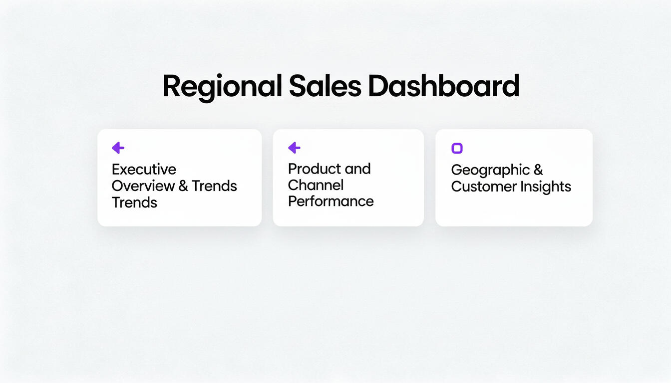
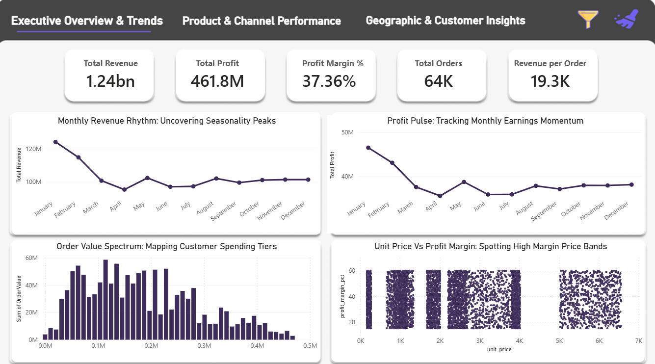
- Decision: Focused 2017 analysis on clean seasonal patterns to avoid noise from year-end outliers---Dashboard Design & FunctionalityUsing EDA insights as the blueprint, I designed a 3-page Power BI report optimized for stakeholder self-service:Page 1: Executive Overview & Trends
- Monthly Revenue & Profit Trend – Time-series visualization with clear seasonality
- Order Value Spectrum – Distribution of average order values
- Unit Price vs. Profit Margin Scatter – Product-level profitability analysis
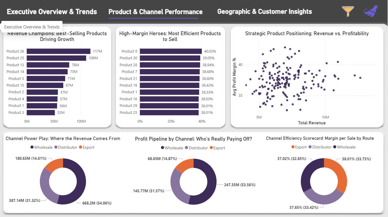
- Interactive Slicers – Year, channel, and region filters for dynamic explorationPage 2: Product & Channel Performance
- Revenue by Product – Ranked list of top performers
- Revenue by Channel – Breakdown across Wholesale, Distributor, Export
- Profit Margin by Product & Channel – Identify high-margin, low-volume opportunities
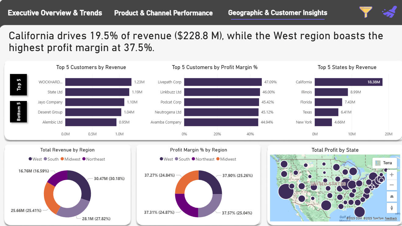
- Trend Analysis – Channel-specific performance over timePage 3: Geographic & Customer Insights
- Top/Bottom Customers by Revenue – Customer concentration analysis
- Top/Bottom States by Revenue & Margin – Regional performance heat map
- Geographic Breakdowns – State-level profitability and volume metricsBusiness Value
This dashboard enables stakeholders to answer critical questions such as:
- Which regions are underperforming against 2017 budget targets?
- Which products deliver high margins but low revenue (candidates for targeted promotion)?
- How is revenue distributed across wholesale vs. distributor vs. export channels?
- What seasonal patterns should inform inventory and marketing planning?---Key Deliverables✓ Cleaned, transformed dataset with calculated metrics
✓ Entity-Relationship diagram documenting data model
✓ Python EDA notebook with exploratory visualizations
✓ 3-page interactive Power BI dashboard
✓ Self-service analytics environment for stakeholders---Technical Highlights- Data Quality: Systematic cleaning and validation across 5+ tables
- Relational Modeling: Proper key management and join logic
- Feature Engineering: Derived meaningful business metrics (AOV, margins, profit)
- Analytical Rigor: Budget comparisons handled carefully to avoid false conclusions
- Dashboard UX: Intuitive navigation with contextual filters and focused KPIs on each pageProject repository on GitHub